Intelligence
Intelligence
In 2016, I moved from the London services business to join Tigerspike’s global Products Team as a Design Director of their core product. Intelligence is a data mining and data visualisation web platform helping businesses make data-driven decisions and track impact. This was a very complex problem worked by a global team, with an intense agile aprroach. Here, I’m trying to share more of my learnings from that period than tell a linear story of the product’s design.
Awards
- European Design Awards 2016
Finalist on Information Websites →
Info
- Responsive web app
- 2016–2017
- As resident of Tigerspike
Skills
- Product Design & Design Direction
- UX/UI Design
- Branding & Marketing


Context
Most global companies were —and still are— in the midst of some form of digital transformation. It is not easy and few get it right. Depending on where you look, the measure is between 62-84% of IT initiatives that fail. No matter where you look that is a big number.
Success happens when there is clear alignment on success throughout a team, when a team is fully empowered to make the right decisions at the right times, and most importantly when a team can monitor in real-time the impact of those decisions.
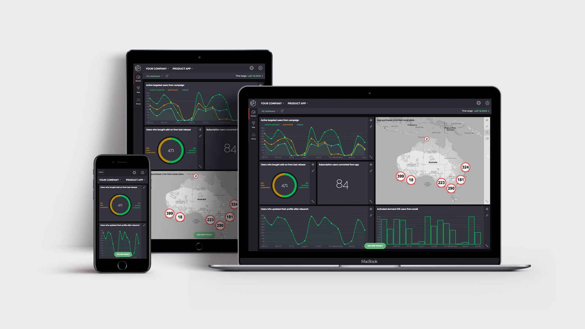
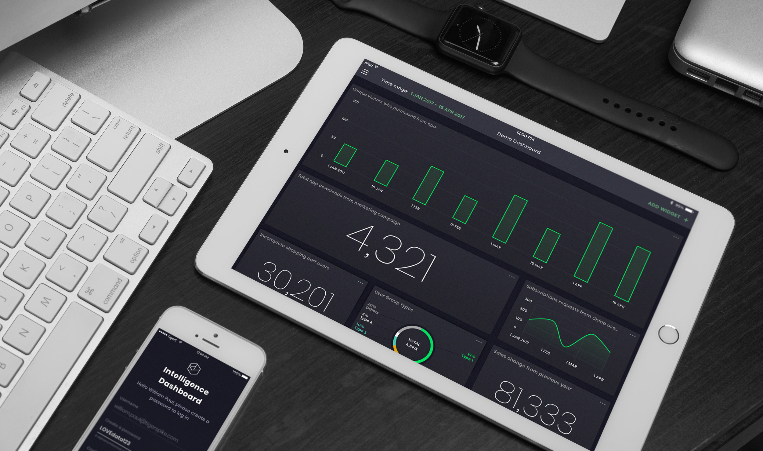
The amount of high-value data worth analysing in 2016 was predicted to double by 2020 and existing solutions made it very hard to identify the most important data points, let alone extract insights. Designed to tackle these issues, Intelligence allowed businesses to measure the impact of decisions through a real time view of complex data sets, ingested from multiple sources (Salesforce, SAP, Oracle, Google Analytics). Each configurable widget gave an aggregate view of a specific success metric, allowing non-technical business users to focus on their own measure of success.
“We have so much data, it’s like drinking from a firehose. You helped us make some sense out of it and finally benefit from it.”
– Client’s reaction after seeing Intelligence in use.
In the beginning
We started by spending some weeks researching and bringing in together a core team from all the offices, to collaborate in workshops on use cases, personas, user experience, technology and the potential market fit for the product.
Regardless of our excitement about all the things we added on the backlog (and our personal preferences), the first interviews with clients and the global sales teams showed that we had to start with merging data and building a real-time visualisation tool.


Data visualisation is about simplicity, not bells and whistles.
The main goal was to simplify the data and present it using easy to read visuals. Creating and personalising the Dashboard had to be simple; so the business would know they are looking at the right data at the right time when making decisions.
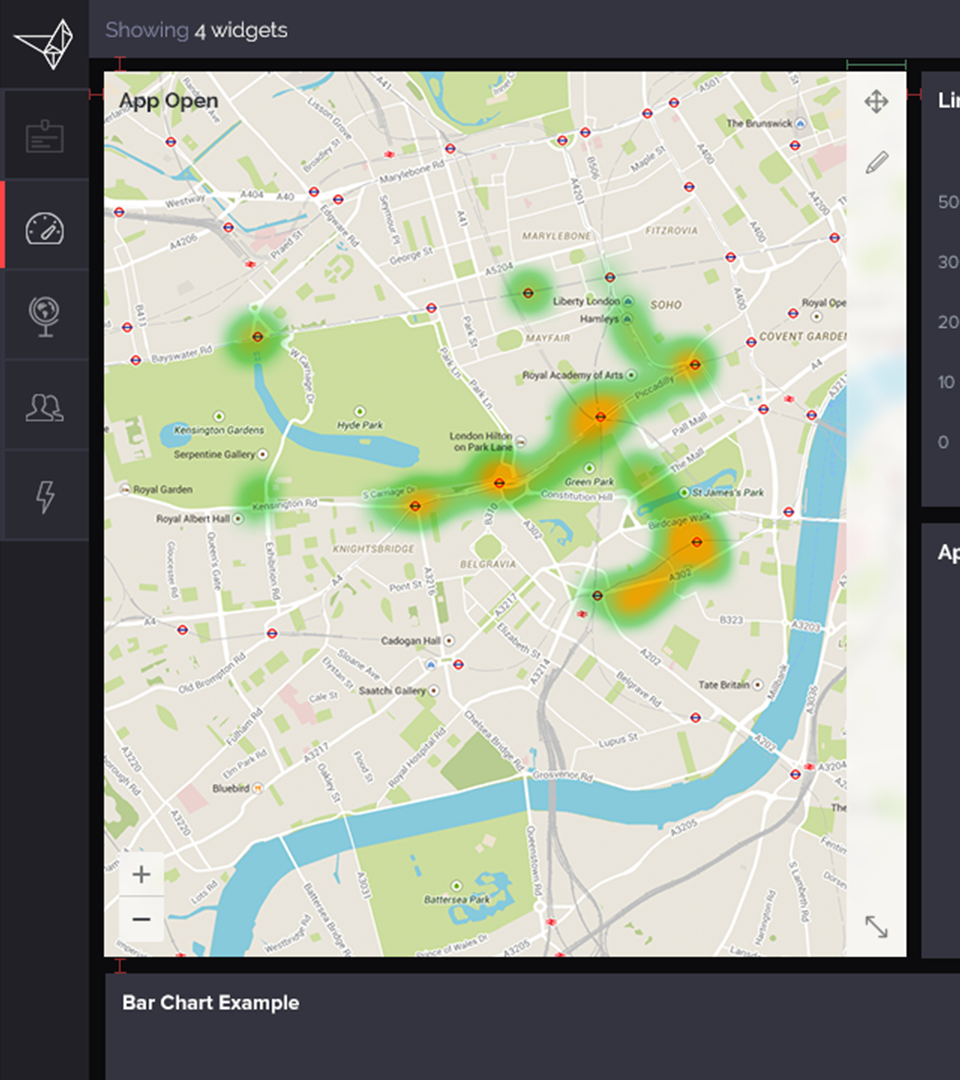
We started with two types of data representation; maps and simple charts or plain numbers. Of course, later on more types of charts options were added for the users. However, what proved to be the core value of the platform was the the dashboard’s customisation; being able to choose which data users see and quickly change that based on their context (time, location, device, authority, etc.)
After presenting the first version to customers and implementing it to their solutions, we got amazing feedback of how impressive it is to see big data simplified and presented like that. I still remember the time when a senior person from a client’s side said “We have so much data, it’s like drinking from a firehose. You helped us make some sense out of it and finally benefit from it.”
There so many different types of charts and graphs, 2D and 3D visualisation models a designer can use to present data. Also, the available libraries that a team can use are countless and some so flexible with visual customisation that the results can be stunning. However, what is always highly appreciated is not the first-time wow factor, but the efficiency, simplicity, and clarity of the represented data, mainly coming from the typography and the colour palette (from the visual design point of view) and the fast response of the platform (the hardest part for the engineering team).


Design challenges
Designing for a product with a global footprint is challenging. The strategy, design and marketing team was in London and there were supporting team in Singapore and Sydney, while we also had contributors from New York.
Working as a startup, in agile and with global teams is an incredible experience and has both pros and cons. ¶ On the positive side, you can get feedback and combine insights (design, technology, market and cultural) from around the globe, working around the clock with great speed. By the time the design team gets to the office, the last day’s implementations or tests have already been made during the day. It was like a relay race. ¶ On the negative side, I can only comment on how tiring this can be, especially due to the extreme need for documentation while moving fast.

Innovations
There were many things that I’ve learned and many more that I enjoyed during this journey. One of the top was the fact that I had the opportunity to experiment and think innovative solutions. I always aim for simplicity when designing interfaces and with Intelligence my team achieved a high level of intuitiveness using layered panels and widgets, contextual menus, fast micro-animations, helpful interactions, and —my favourite personal contribution— the introduction and use of “natural language” into a highly technical product.
From the data entry to data visualisation, from geolocations to contextual actions setup, all could be done by using simple sentences. The greatest value of this was that in the future everything could be captured or reported just by using voice, while it would be incredible if we could have live translation from and to any language to support global team working in their native language.


